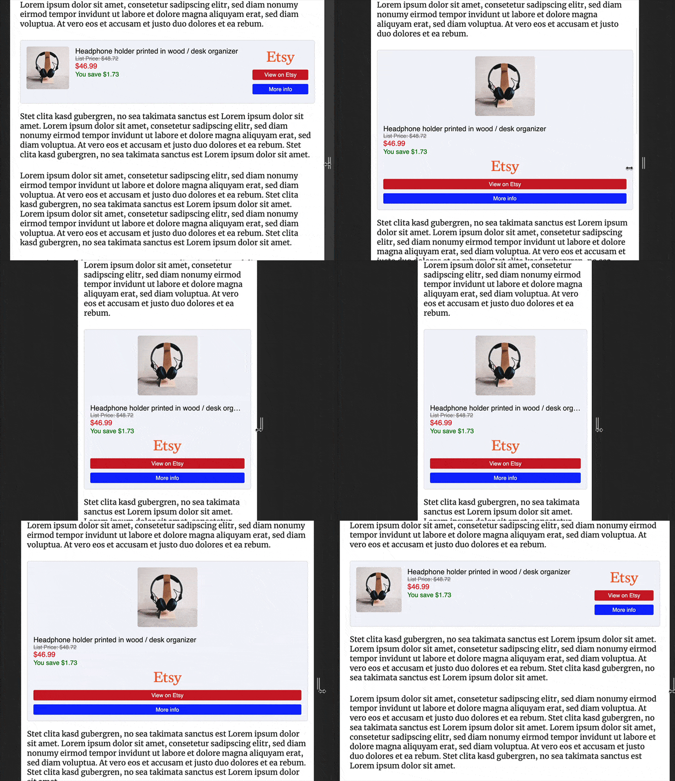
On this page, ASA’s managed template “Robust” is used. It is designed to work with any kind of product and any screen size. It comes with many options to customize its appearance without having to change the code.
Contents
Main features
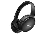
Example
This first example is built with the following shortcode:
[asa2 tpl="Robust"]B098FKXT8L[/asa2]

Customization
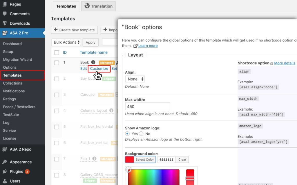
On ASA 2’s admin page “Templates” you can customize the general options of template “Robust“. These settings will effect every usage of this template.
Shortcode options
Besides the general settings, it is possible to overwrite template options per shortcode.
For example, to use a custom button color, this shortcode would make the difference::
[asa2 tpl="Robust" button_color="#f35c11"]B098FKXT8L[/asa2]

Example “title font style”
To set a custom title font style, use option “savings_bg_color”::
[asa2 tpl="Robust" title_font_css="24px arial, sans-serif;" title_color="purple"]B098FKXT8L[/asa2]

All available options:
Following you find a list of all available shortcode options for template “Robust”:
| Layout | |||
|---|---|---|---|
| Option | Type | Values | Description |
| align | string |
|
Align |
| max_width | int | 0 between 9999 | Max width. Max width in pixels. Leave blank for 100%. |
| background_color | string | CSS compatible color value, like hex values (#ff0000) or color names (red) | Background color |
| border_color | string | CSS compatible color value, like hex values (#ff0000) or color names (red) | Border color |
| border_width | int | 0 between 99 | Border width. In pixels. 0 for no border. |
| border_radius | int | 0 between 99 | Border radius. In pixels. > 0 for rounded corners. |
| box_shadow_css | string | custom text | Box shadow style. Utilizes the CSS box-shadow property. Example: "0px 0px 20px 10px rgba(44,54,92,0.2);" |
| Image | |||
| Option | Type | Values | Description |
| image_size | string |
|
Image size |
| image_max_width | int | 0 between 999 | Image max width. In pixels. 0 - 999. 0 for none. |
| image_max_height | int | 0 between 9999 | Image max height. Image max height in pixel |
| Title | |||
| Option | Type | Values | Description |
| title_color | string | CSS compatible color value, like hex values (#ff0000) or color names (red) | Title color. No default. The title will be displayed in the default text color of your page, if none is set here. |
| title_font_css | string | custom text | Title font style. Utilizes the CSS font property. Example: "15px arial, sans-serif;" |
| Price | |||
| Option | Type | Values | Description |
| price_color | string | CSS compatible color value, like hex values (#ff0000) or color names (red) | Price color. The color in which the price text is displayed. |
| hide_price | bool | "yes" / "no" | Hide price(s) |
| price_font_css | string | custom text | Price font style. Utilizes the CSS font property. Example: "15px arial, sans-serif;" |
| show_price_disclaimer | bool | "yes" / "no" | Show price disclaimer. "Details" link next to date of last update. |
| last_update_format | string | custom text | Last item update date format. Used in price disclaimer. Supports PHP date function format. Example: d.m.Y H:i:s |
| show_merchant | bool | "yes" / "no" | Show product merchant (if available) |
| Button | |||
| Option | Type | Values | Description |
| button_border_radius | int | 0 between 999 | All buttons border radius. In pixels, > 0 for rounded corners. |
| button_font_css | string | custom text | All buttons font style. Utilizes the CSS font property. Example: "15px arial, sans-serif;" |
| button_color | string | CSS compatible color value, like hex values (#ff0000) or color names (red) | Buy button background color |
| button_color_hover | string | CSS compatible color value, like hex values (#ff0000) or color names (red) | Buy button hover color |
| button_text_color | string | CSS compatible color value, like hex values (#ff0000) or color names (red) | Buy button text color |
| more_info_button_color | string | CSS compatible color value, like hex values (#ff0000) or color names (red) | More info button color |
| more_info_button_color_hover | string | CSS compatible color value, like hex values (#ff0000) or color names (red) | More info button color hover |
| more_info_button_text_color | string | CSS compatible color value, like hex values (#ff0000) or color names (red) | More info button text color |
| button_padding | int | 0 between 999 | Button padding. Padding in pixels |
| Ratings | |||
| Option | Type | Values | Description |
| show_ratings | bool | "yes" / "no" | Show rating stars |
| show_total_reviews | bool | "yes" / "no" | Show number of total reviews |
| Savings | |||
| Option | Type | Values | Description |
| show_savings | bool | "yes" / "no" | Show savings text |
| savings_color | string | CSS compatible color value, like hex values (#ff0000) or color names (red) | Savings text color |
| savings_font_css | string | custom text | Savings text font style. Utilizes the CSS font property. Example: "15px arial, sans-serif;" |
| Details | |||
| Option | Type | Values | Description |
| show_features | bool | "yes" / "no" | Show product features (if available) |
| features_length | int | 0 between 99 | Number of features. How many feature items to show before the "Show more" link. 0 = no limit. |
| feature_text_length | int | 0 between 1000 | Feature text max length. Maximum number of letters for each feature before the "..." get displayed. 0 = no limit. |
| features_font_size | int | 1 between 100 | Features font size (in percent) |
| show_description | bool | "yes" / "no" | Show product description (if available) |
| description_font_size | int | 1 between 100 | Description font size (in percent) |
| description_length | int | 0 between 1000 | Description length. Number of letters before the "show more" link get displayed. 0 = no limit. |
| Misc | |||
| Option | Type | Values | Description |
| disclaimer | string |
|
Disclaimer. Shows an asterisk in buy button. |
| structured_data | string |
|
Structured Data. Include structured data at the end of the template |
| custom_css | string |
|
Custom CSS. Custom CSS that is applied to all occurrences of this template on a page and is only included once in the source code. |

